Follow These Practical Design Guidelines To Laser Cut With Confidence
If you are a designer or engineer selling the products you make, or using them to brand your business, you know it takes more than just an original idea or a unique product to be successful. In competitive marketplaces such as Etsy and Kickstarter, and in big trade shows, conferences and events, not only do your products need to be designed well, but you may also need strong branding, web presence and beautiful product photos in order to capture customers’ attention.
It may seem overwhelming at first, but fear not! This article will help you gain an understanding of basic graphic design and offer a set of practical design guidelines so you can laser cut with confidence.
Graphic Design Basics
Everything made by humankind has involved some level of design decisions. Look around. Computers, desks, chairs, coffee mugs, sweaters, shoes. Everything has been touched by a designer who made decisions about the visual and physical nature of that product based on its intended use and desired visual style.
Whether you are developing the latest tech gadget, making laser cut jewelry or designing 3D printed homewares, you too will be making tons of design decisions. Consumers want their purchases to look good and work well, so it is crucial for designers and engineers to have a strong understanding of graphic design basics when approaching their work. It is the designer’s job to weigh form against function when creating beautiful and usable products.
Good design is effective design. It appears effortless, like it was meant to be. Nothing less, nothing more. As described by Irene Au, “Good design is like a refrigerator. When it works, no one notices. But when it doesn’t, it sure stinks.” In other words, good design is expected. Things look and feel right, although this feeling often goes unnoticed by the untrained eye.
It can seem like an elusive goal, but a basic knowledge of design theory will make it significantly more tangible. Design theory involves, but is not limited to, the proper use of design principles and elements to result in good design. Design elements refer to the fundamental components of a design composition, while design principles refer to the way those elements are used together.
Over time, there have been countless movements in design theory. It’s a dense subject that many brilliant minds have approached, pondered and interpreted. While there is no singular unified doctrine of design theory that all designers follow religiously, there are several design concepts that approach universal acceptance in design theory. Below we will look at 7 design elements and 7 design principles that every maker should know.
The 7 Elements Of Graphic Design
A design element is the most basic unit of visual design and the most fundamental ingredient from which all designs are created.
Let’s imagine that creating a design piece is like building a house. Design elements would be the raw materials, such as brick or wood. How the chosen materials are used will impact the overall look, feel and functionality. Knowing the purpose of the house and intended style helps the architect make decisions about materials.
A good example is a log cabin, which we generally understand is suited for a mountain home. It would look way out of place near a beach or in a desert. But why? Well, the material in question has certain attributes, or qualities, that make it suitable or not suitable for this house.
Logs are perfect for a mountain home functionally because they are naturally abundant materials in the mountains, they can weather unpredictable mountain storms and they posses thermal mass to help keep the house warm. The logs also visually align with the natural setting in the mountains. The choice of material is based on a combination of function and style.
Similar to the logs of wood, design elements are like materials at your disposal as a designer. These basic building blocks, the 7 elements of design, are line, color, value, shape, texture, space and form. Each one has its own set of attributes that can work toward or against your idea or intention in both function and style. In other words, designers can communicate ideas or concepts using the 7 design elements, which can be used alone or in combination with each other depending on the goals.
Designers who plan on laser cutting products should consider design elements in both a visual and physical context. The physical materials used in the final product are design elements in and of themselves. Designing for the laser cutter means considering the materiality of the final product throughout the design process. Let’s take a closer look into each design element to gain a better understanding of how it can be used.
Line
The first and most fundamental element of design is the line, which is the starting point for most designers staring at a blank canvas. In the context of graphic design, line is defined as two connected points in space. Lines can hold many attributes, such as being thick, thin, fine, brushed, smooth or rough, horizontal, vertical, diagonal, curved or bent, dashed, dotted, continuous or broken as shown by this image from Elements Of Design.
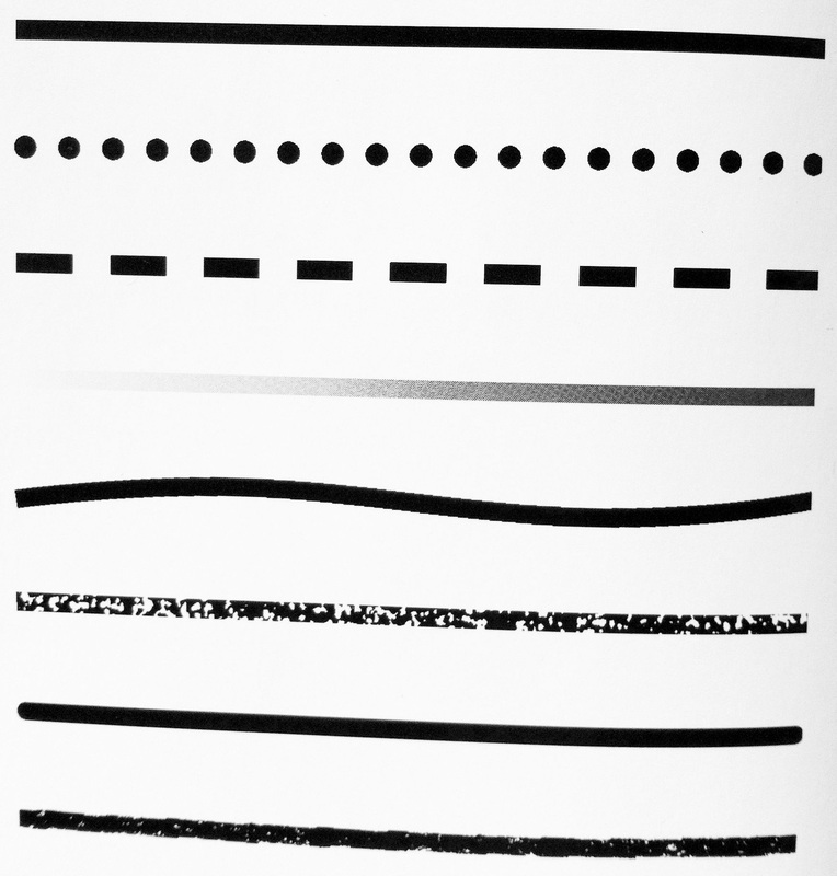
Designers often use lines to direct the eye to a specific point, divide space, denote emphasis and create texture.
In laser cutting, line is a required element as the laser cutter moves along lines on a linear field. Laser cut design files are essentially line drawings provided to the laser cutter, which translates these line to a physical product.
Color
Color is the second element of design, and similar to line, color can be used to set mood or tone of a design. Greens and blues, for example, tend to have a calm and relaxed appeal. Reds and oranges, on the other hand, are more powerful and passionate.
There’s a whole science behind picking colors based on what they mean and how they make us feel, as seen in this image from Digital Arts Online.
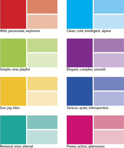
Using color to tap into these emotions can make designs more successful at achieving the desired response. In the case of makers who sell their products, this desired response = a purchase.
For a more complete understanding of color, let’s look at the following characteristics:
Hue: Often used as just a fancy name for color (ie. magenta, green, blue), but it also means a pure color before any black or white is added to it.
Shade: The addition of black to a hue, making it a darker version of the pure color.
Tint: The addition of white to a hue, making it a lighter version of the pure color.
Tone: The addition of grey to a hue, making a muted version of the pure color.
Intensity: Speaks to the brightness or purity of a color. A true hue is said to have a high intensity, whereas it’s shade, tint or tone has a low intensity.
To learn more about color theory, check out this easy approach on Medium or tap into Pantone’s color intelligence articles here.
For those laser cutting designs, color certainly plays a role not only in material choice but also overall composition. Check out the Ponoko Materials Catalog to see the vast selection and don’t miss these articles to see the materials made into real products for inspiration.
Value
Value describes the range of lightness and darkness of an color. This value scale image from Tes Teach illustrates what happens as black is added to white to make shades of grey.
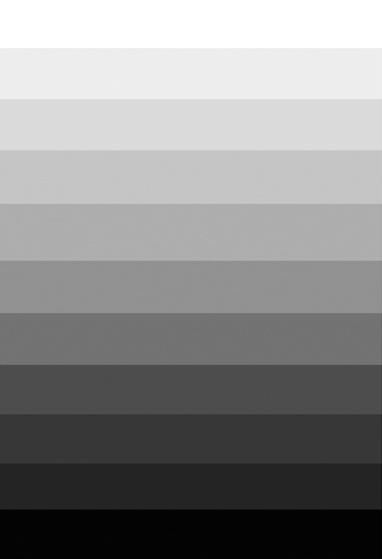
This concept is important for designers not only in simple color choice but also because value defines forms and creates spatial illusions. “If values are close, shapes will seem to flatten out, and seem closely connected in space; none will stand out from the others,” explains Charlotte Jirousek in Art, Design and Visual Thinking. “If values contrast, shapes will appear to separate in space and some will stand out from the others. This works whether the colors are just black, white and gray, or whether hues are involved.”
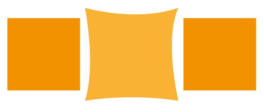
Shape
Simply defined, a shape is the quality of a distinct object or body in having an external surface or outline of specific form or figure. This delineation of space can be accomplished using color, line, value or texture.
We’re surrounded by so many shapes (homes, offices, cars, trees, flowers, cats, dogs) that we may not think about them much. But for the designer, shapes are at the root of graphic design. “They are figures and forms that makeup logos, illustrations and countless other elements in all types of designs,” writes author and web designer Jennifer Kyrnin in this Lifewire article. “Shapes help the designer to add interest or organize elements of a design. They are not strictly ornamental, either, as shapes can have symbolic meanings, invoke feelings or be used to direct the eye to the most important information.”
Shapes can be described in three ways: Mechanical, organic or abstract.
Mechanical shapes are those with hard edges and are usually geometric, offering a feeling of stability and order in a design.
Organic shapes are irregular and often feature curves or unexpected angles, which creates a more natural and expressive design.
Abstract shapes are things like letters, icons or symbols and can help convey a message.
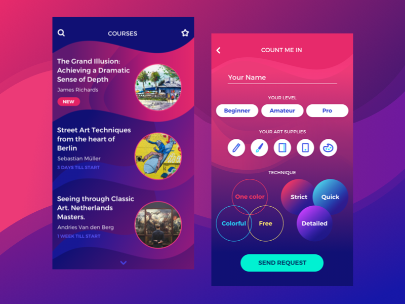
In the above example from UX Planet, shape plays an important role in the success of the design for an art courses app. Circles have no angles, so there is a softer and milder feel than if polygons were used.
When laser cutting, you’re paying for every movement the laser makes. Many small detailed shapes take longer to trace out than fewer larger shapes. Circles take longer than straight lines. And since time = money when laser cutting, the shapes you choose will not only impact the aesthetic appeal of the product but also the cost.
Texture
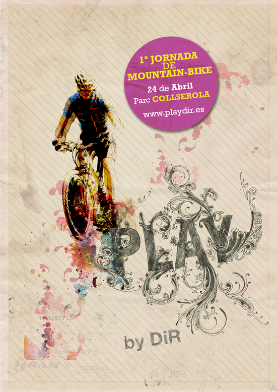
In design, texture has two definitions. The first is the visual texture, when texture appears to exist on a flat surface via the use of line, shape or color. A photograph of tree bark, for example, shows much visual texture naturally. In graphic design, this poster seen on Abduzeedo advertising a mountain bike race uses texture to add an emotional and real-life response.
The second definition of texture is tactile, the physical texture or feeling of a design element such as smooth, soft, rough, fluffy, etc.
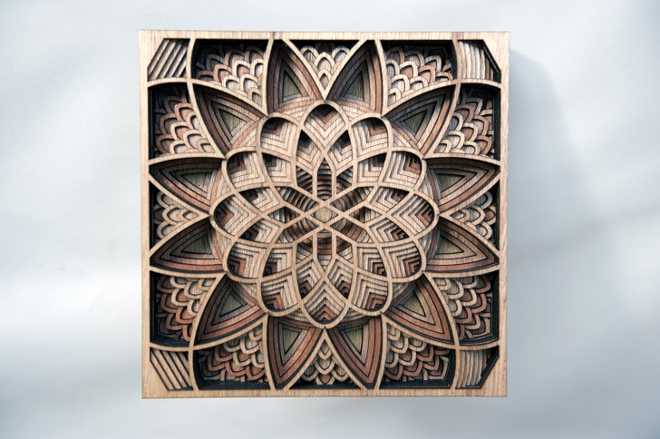
This piece of laser cut art by Gabriel Schama on inhabitat is a beautiful example of both tactile and visual texture. She glues together layer after layer of ?” mahogany wood that has been intricately laser cut in a variety of geometric shapes. The layers of wood have a tactile texture when touched, and the physical depth of the layers gives a visual texture when simply viewed from afar.
Texture is particularly important for designers working on laser cutter projects because the end product is a physical object with inherent tactile texture. Thinking beyond simply making something that looks good, designers must also consider how texture communicates a design aesthetic with material choice. The inherent hardness of stainless steel, for example, has an industrial vibe whereas the softness of felt is crafty and warm. Laser engraving can add another level of texture, both visual and tactile depending on the material.
Space
The least obvious of the seven design elements, space allows designers to take two-dimensional spaces and create the illusion of a three dimensions. This is accomplished through a variety of techniques:
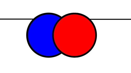
Overlapping: By putting some objects overlapped in front of others, designers can start to create the illusion of space. Shapes in the foreground should always sit in front of those in the background as seen in this Image courtesy of The Virtual Instructor.
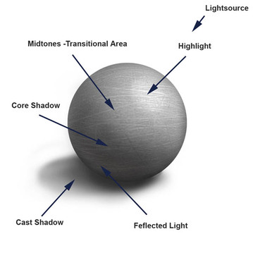
Shading: Adding a gradient of a values to a shape gives the illusion of a 3D object. This image from Elements of Design demonstrates how shading is accomplished by first identifying the light source then identifying the areas for highlights, midtones, shadows and reflected light based on the position of the light.
Atmospheric Perspective: This technique of rendering depth or distance within a space refers to the effect the atmosphere has on objects. As explained by this example image from Web Design for Instructors: “Atmospheric perspective uses color and value contrasts to show depth. Objects which are further away generally have less distinct contrast; they may fade into the background or become indistinct dark areas. The foreground objects will be clear with sharper contrast.”

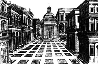
Linear Perspective: This technique is how designers create the illusion of depth on a flat surface as well as identify a focal point. Objects that are far away look smaller, even if they aren’t small in reality. Think about driving down a long stretch of highway. The lines on the highway get smaller and smaller until they disappear at the horizon.
Web Design for Instructors explains: “Linear perspective is based on the idea that all lines will converge on a common point on the horizon called the vanishing point. Any walls, ceilings, floors or other objects with lines will appear to come together at the horizon line. These lines converging lead our eyes towards that focal point. Often, the most important object or person will be located at that point. You can see in the drawing below how all the lines seem to lead your eye toward the church in the center back of the drawing.”
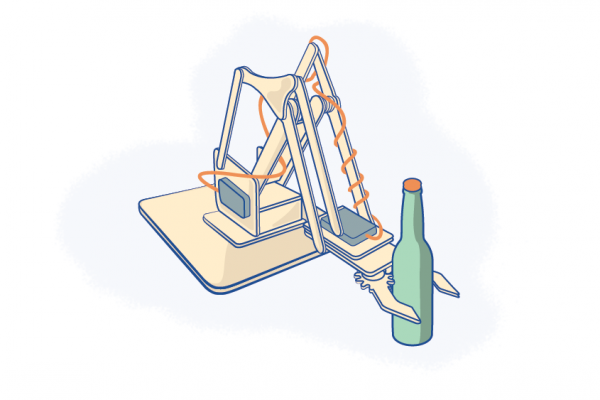
While most of the design principles within the element of space are more obvious in drawing and painting, it is applicable to laser engraving. An example can be seen in the work of Dan Narva of Nine Day Weekend.
While most of Dan’s laser cutter projects revolve around making coasters, he found that he could transform photographs into custom images that are laser engraved into solid pieces of wood. He uses overlapping to give dimension to a couple’s wedding image, for example, and linear perspective comes into play when he creates a custom commemorative for a new homeowner. Read all about it here.
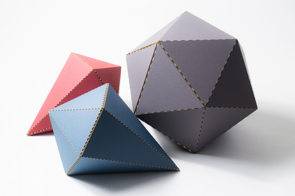
Form
Form refers to objects that are three-dimensional and is useful concept for defining space, adding volume to a composition and adding contrast. A form will always have height, width and depth, which can be accomplished using other design elements such as value, line and shape.
In laser cutting, forms can be created in a variety of ways. These geometric forms were made by including a dashed cutting line, which becomes the fold line, in the design.
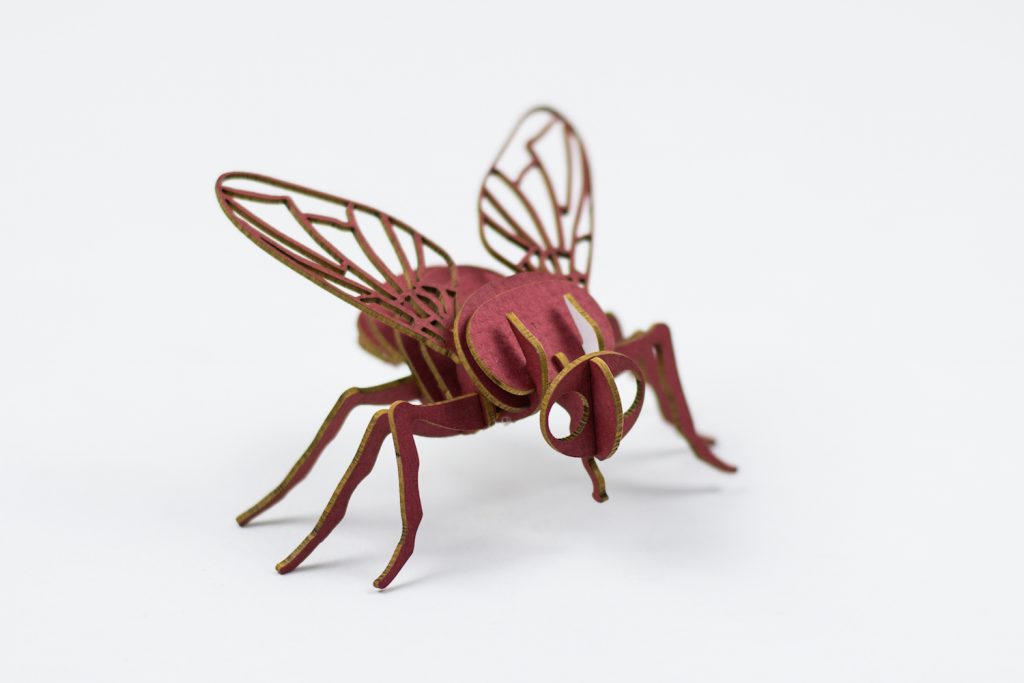
And for this little bug, flat laser cut pieces were slotted together to create a three-dimensional piece.
The 7 Principles Of Graphic Design
We’ve covered the design elements, now let’s look at the 7 design principles. Design principles refer to the way a design elements are used together. These principles are balance, unity/harmony, hierarchy, scale/proportion, dominance/emphasis, similarity/contrast and white space.
Design principles are like rules, a set of guidelines based on practice and research for using design elements together effectively, that a designer should follow. Going back to the house analogy from the beginning of this article, design principles would be the way the house is constructed or the way the materials are put together to create the house.
For example, bricks (the material) are used to make the walls. They are layered in a staggered pattern that is both visually pleasing and structurally strong, making it successful functionally and aesthetically. However, it would seem wrong to see the same bricks used on the floor of the master bedroom. Hardwood or carpet is typically a better choice. These unspoken rules about which materials to use, where to use them and how to use them are our metaphorical equivalent to design principles.
In the same vein as design elements, the use of design principles can either help or hurt the functionality and stylistic vision for your piece. How you put the design elements together, or compose your design, is just as important to consider as the elements that you chose include.
For designers who are laser cutting their projects, knowing these design principles will help you understand how to effectively and efficiently put your laser cut pieces together. Let’s take a closer look at each of the 7 design principles to gain a better appreciation of how to take advantage of them.
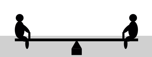
Balance
Balance makes a design feel stable and is considered when designers make layout and composition decisions. All elements of design hold a visual weight. The principle of balance speaks to the even, but not necessarily equal, distribution of design elements.
Balance can be described as symmetrical or asymmetrical. Let’s see what these look like with the help of images courtesy of Smashing Magazine.
Symmetrical balance is when the weight and value of a composition is essentially mirrored over an imaginary vertical line down the center of the canvas.
Asymmetrical balance is when the two sides are not mirrored, but the elements are arranged so that there is a sense of balance.
When a design is unbalanced, it feels uncomfortable because the elements and composition don’t make sense.
But balance is more than weight of object size. Balance is also achieved by using color, shape, position, value, texture and eye direction. Get the specifics of how to incorporate these principles of balance with this article from Jayce-O-Yesta.
Unity & Harmony
Unity and harmony speak to the intangible feeling that all design elements belong together, creating a sense of completeness. When a design has harmony, the design elements are working in unity. The goal of any design is to communicate something. Without strong unity, this communication breaks down and the design fails.
The entirety of the design is more than the sum of its parts. With the right composition, different design elements will appear to belong together. Repetition, similarity and proximity can add this visual feeling of completeness to your design.
In this image from Pluralsight, similarity in shape is used to establish unity. The image on the left is comprised of individual squares, and these squares are mirrored on the right side with the small colored boxes adjacent to the text. The repeated square shapes bring the layout together and make it unified.
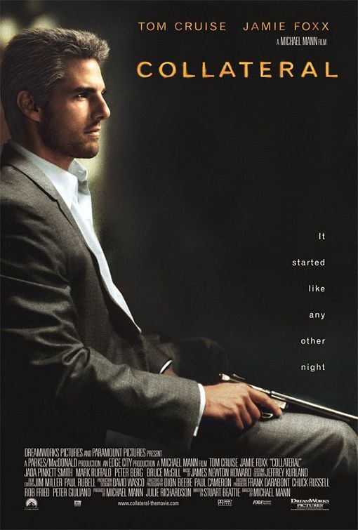
Another technique to establish unity is through similarity in color. In this movie poster (image courtesy of Sitepoint), subdued colors were used for the overall image with a pop of golden highlights on Tom Cruise’s face. This golden hue is then mirrored in the text for the movie title and actors’ names.
Another simple way to create unity is through repetition and proximity. These dots in an image from Pluralsight demonstrate both principles perfectly. Not only is the circle pattern repeated, each one is also placed close to one another with linear alignment to form a unified shape.
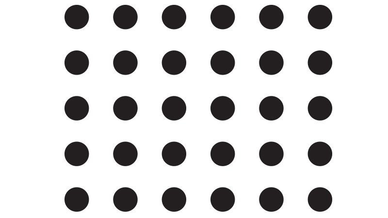
If you removed some of the dots, you’d lose the repetitive shape and the design would look disjointed. Likewise, if you scattered the dots around to where some were in close clusters and others were far away, the proximity would go from order to chaos.
While this example primarily used shape as the means to demonstrate repetition, you can also create repetition with color. In this case, the circles are all black but they could be any single color. Multiple colors could also be used, if there is proximity. Perhaps the first horizontal line is all red, then green, then blue and so on. But if all 30 circles were a different color, you would lose overall unity even with the repetition of shape and close proximity.
If you want to learn more about unity and harmony in design, dive into this Prezi.
Hierarchy
Hierarchy is the order in which a viewer looks at design elements within a composition. A designer only has a few seconds to capture attention, so it’s important to let the viewer know where to look first, second, third, and so on.
The eye is naturally drawn to larger parts of the design first, so viewers tend to always look at the largest object before anything else. In design terms, that means a large object will have more hierarchy than a smaller object.
Another tendency of the human eye is to look for anything irregular in a design or pattern. If an element has a different visual weight than the other elements in the design, it will have more hierarchy.
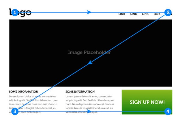
In an article from 99designs, the six principles of visual hierarchy are explained. One of the first principles is page scanning patterns, as demonstrated with this image of what a z-pattern looks like. When info isn’t presented in block paragraphs, the reader’s eye first scans across the top of the page, where important information is often found, then moves down to the opposite corner at a diagonal to do the same thing across the bottom of the page.
For more visual insights, check out this infographic that explains the 12 visual hierarchy principles every designer should know and how to use them to your advantage.
Scale & Proportion
Scale is how design elements relate to each other in size, weight and placement. Proportion is the relative size, weight and placement of an element to the whole design. The right scale and proportion ratios of elements help bring a feeling of balance.
Michelangelo’s David an excellent illustration of both scale and proportion. This image from Sophia.org shows that he is powerful in size; ideal in proportion.
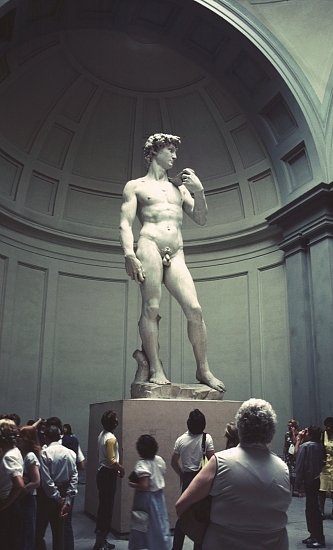
“The scale of this overwhelming figure is larger than life: Over 13 feet tall. In addition it is placed on a pedestal taller than the average human, so that the sculpture towers far above the viewer. This gives it a sense of godlike grandeur,” writes Lucy Lamp. “The proportions within the body are based on an ancient Greek mathematical system which is meant to define perfection in the human body.”
Contrary to David’s perfection, when a design is “out of proportion,” the relative size and weight of two or more elements seem wrong in terms of the size and ratio in relationship to each other, such as a person with a tiny head. That being said, designers can exaggerate size and ratio to convey a message or idea, such as the exaggerated size and ratio in this image courtesy of Visual Communication Design.

Dominance & Emphasis
A dominant design element is the focal point of your design and where the viewer’s eye spends the most time. These design elements will be highlighted to have more hierarchy than others within the composition.
Making these elements larger in size or brighter in color are two ways to accomplish this effect. The general rule is to make sure the area of you want to highlight is in contrast to the rest of the design, whether that be in size, shape, color, texture, etc.
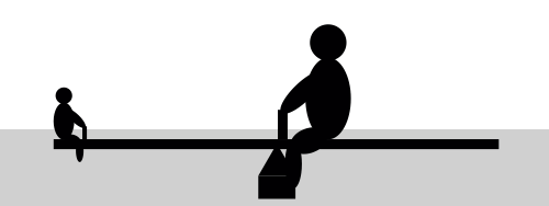
In this example from John Lovett, there is no dominant object, and as such, your eyes don’t know where to go because there is no focal point in the image.

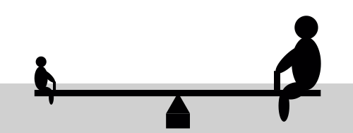
In his second example, one boat is now clearly larger than all the others. Dominance has entered the picture, and there is much more clarity and balance to the overall composition.

Similarity & Contrast
Designers often take advantage of the Gestalt principles, a set of rules describing how the human eye perceives visual elements, to successfully leverage similarity and contrast. Gestalt, meaning “unified whole,” refers to how the human eye naturally groups together visually or conceptually similar items into a larger whole.
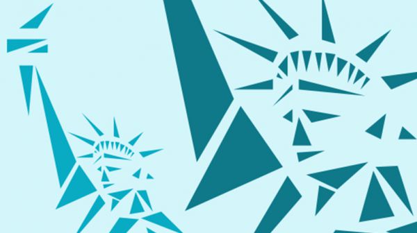
A strong tool in bringing unity to your work, similarity in design speaks to the repetitive use of similar design elements in the same design composition. In this image from Creative Bloc, all the elements in the design have the same basic shape characteristics of a triangle. Thus, there is similarity throughout the overall design of the Statue of Liberty.
Contrast, on the other hand, describes when two design elements in proximity have blatantly opposing qualities. A design element with contrast will always catch the viewers attention, as opposed to seeing all elements together as a whole, which is demonstrated by this image also from Creative Bloc.
The larger size, different shape and lighter color of the middle square breaks the pattern of similarity and draws the viewer’s attention toward the center focal point.
For a deeper exploration into the ways to use contrast (including size, formatting, color and shape), check out Fruit Bowl Media. And learn more about all of the Gestalt principles at Interactive Design Foundation.
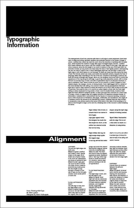
White Space
White space, or negative space, describes the empty part of the design composition, or the part of the design canvas that is left untouched. While the principles and elements discussed thus far involve what you add to the composition, this last principle is about what you don’t add.
Allowing for enough white space helps a design feel organized and uncluttered, and it can be used to communicate the designer’s concept further.
In this Vanseo Design article, author Steven Bradley explains that whitespace does three main things in design:
1. Creates grouping of elements
2. Creates emphasis and hierarchy
3. Improves legibility
“Whitespace gives a place for the eye to rest, which it needs in order to absorb the message you’re trying to communicate,” he says. “It’s a visual cue that there’s a break in the content or that the content is finished.”
You can see in this image from the same article how whitespace creates the columns, rows and grids that are used to organize the written information on this printed page.
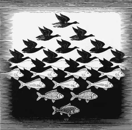
Whitespace can also be used artistically, as can be seen in this M.C. Escher image of Sky and Water I. A renowned graphic designer and master of optical illusions, Escher used whitespace most effectively in these tessellations of birds and fish.
To learn more about how to make the most of whitespace, don’t miss these articles on PrintWand, Treehouse and Design Modo.
Design In Practice
For anyone planning to use the laser cutter, the principles and elements discussed in this article will help you create successful and beautifully designed products that appeal to customers whether you’re selling your wares or using products to promote a business as a brand or agency. Beyond the laser cutter, these design principles and elements can also help with product photos, web page design and personal branding.
Good design is truly timeless, but new ideas and approaches in design concepts are always ahead. Keep up with the latest trends in graphic design with Vengage’s 2018 design forecast.
Ready to get busy designing your first laser cut piece but don’t know how to use the proper tools? We have you covered. Check out our Adobe Illustrator and Inkscape tutorials, and get ready to make your first cut!
Additional thanks to Lisa Horn for supplementary writing and content editing.