Formatting Text For High Quality Outcomes
There are a huge number of fonts available online, but not all fonts are well suited for high quality laser cutting and engraving. In this article we’ll run through some common problems that can occur when laser cutting text and provide some suggestions for selecting the right fonts for your needs.
Fonts for laser cutting overview
- Not a one-size-fits-all: Not all fonts are suitable for laser cutting and engraving. Clear fonts depend on material, project idea, and type of laser cutting project
- Understand vector paths: Ensure consistency in laser cutting by convert fonts to vector paths to retain their intended styles.
- Common fonts: Serif (e.g., Times New Roman), sans-serif (e.g., Arial), script (e.g., Brush Script), and display (e.g., Stencil).
- Beware of small text: Small text can appear patchy with area engraving. Arial Black in all caps works best.
- Cutting Challenges: Cut letters can fall apart or be fragile. For durability, use thick fonts or offset paths to strengthen thin fonts.
How Fonts Work
Put simply, computer fonts are files that are saved on your device and are referenced when you type and read text. These files define the exact styles that are presented. Computers usually come with a number of fonts preinstalled, but there are also many font designs that you can download for free or for a cost online.
While the vast selection of fonts that exist make for interesting variations in styles, if you share a file that contains a font that is not installed to another person’s device, you’ll find the formatting won’t present as you intended. This is why when submitting files to Ponoko for laser cutting, you need to explode fonts into plain vector paths. This eliminates the connection to the installed font file on your computer and ensures intended styles, size and placement are retained.
Types Of Fonts
Here are the most common categories of fonts.
Serif Fonts
Looks like – Small lines added to the end of letters
Typically used for: Printed text – lines are said to create flow for reading
Example font: Times New Roman
Sans Serif Fonts
Looks like – Small lines not added to the end of letters
Typically used for: On screen text – clean shapes make reading on screens easier
Example font: Arial
Script fonts
Looks like: Handwriting or calligraphy
Typically used for: Decorative printed items – styles are often elaborate and visually appealing
Example Font: Brush Script
Display fonts
Looks like: High impact fonts
Typically used for: Signage
Example: Stencil
Engraving Problem #1: Area Engraving Skips On Small Text
Area (aka raster) engraving works like an old school printer, where the head of the laser moves back and forth very quickly removing tiny lines of material one after another, slowly working it’s way down the design. When moving at this speed very small features can be skipped and end up looking patchy. Sections under 0.3mm will almost certainly be problematic and making sure features are larger than this is advisable for reliable results. If text is made too small, any font will have problems with area engraving. Styles of fonts with the least variation in thicknesses will engrave most successfully at smallest sizes.
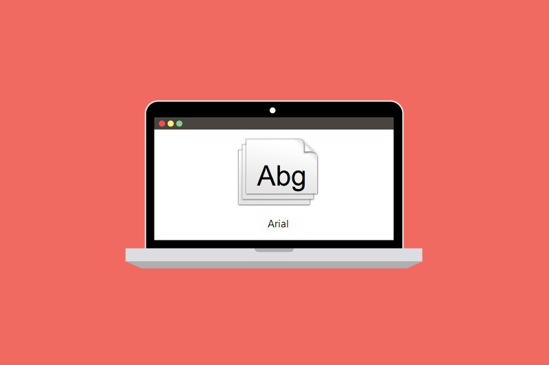
Best type of font to use: Sans-serif
Ponoko’s pick for small text: Arial black (using ALL CAPS)

Alternative option: Switch to vector line engraving instead of area engraving to prevent skipping. With line engraving the laser follows the outlines of the paths drawing out the letters. This will result in a different look to area engraving as the inside of letters will not be filled.
Engraving Problem #2: Line Engraving Results In Outlines
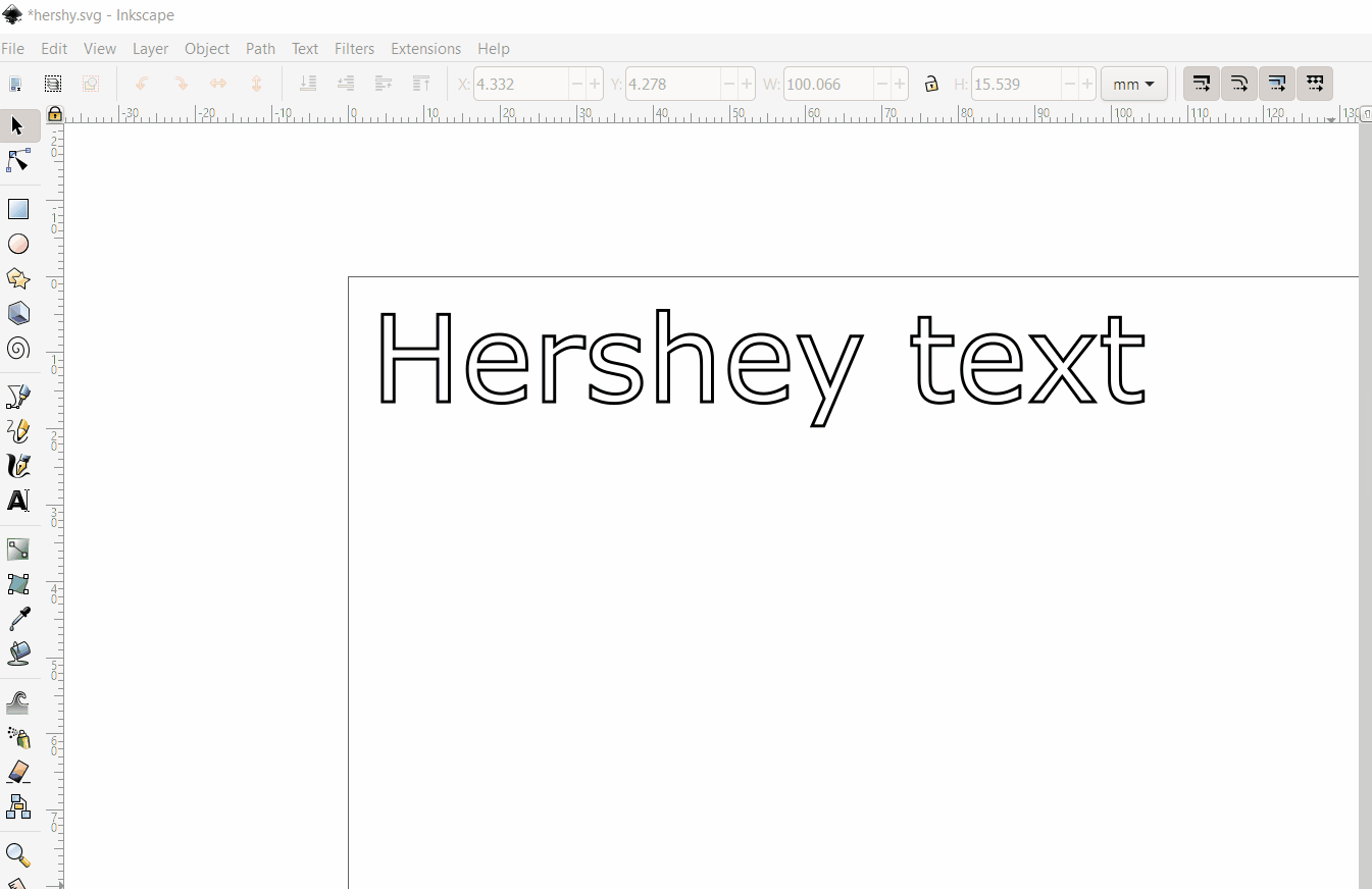
When line engraving is applied to most fonts, the resulting outcome is that the laser draws the outline of paths, essentially doubling up on the amount of work needed to draw the letters. Luckily somebody awesome has developed an extension to the free software Inkscape, where you can convert fonts to single lines. Simplifying a low detail font to a single line with the Hershey extension will reduce the amount of lines being engraved, saving you time and money.
Best type of font to use: Sans Serif
Ponoko’s pick for line engraving: Arial converted to single line with Hershey (gif below)
Cutting Problem #1: Middle Of Letters Fall Away
It’s easy to forget when looking at fonts on screen, that when cut all the parts will end up as separate pieces unless tabbed in. This is typically only a problem if you are making a sign or a stencil, in which case you’ll need to create breaks in the cutting lines to tab the internal parts to the surrounding material. While you can add tabs to designs manually, selecting a font that already has them is much faster and easier.
Best type of font to use: Display Font
Ponoko’s font pick for retaining letters: Stencil

Alternative: Stencilfy adjusts standard fonts to a stencil font by chopping small sections out of letters automatically. See how it works in this article by Tiffany Tseng.
Cutting Problem #2: Cut Letters Are Fragile
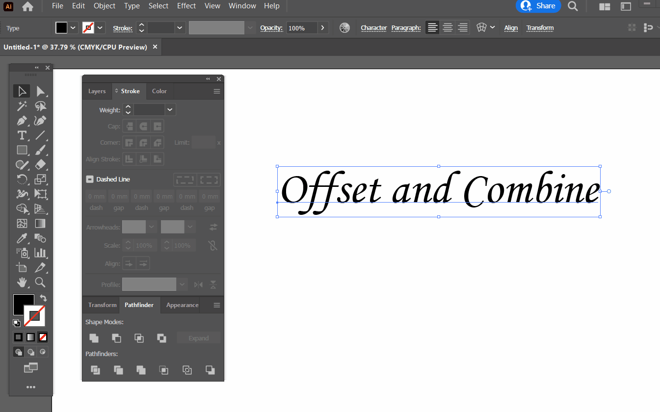
While lasers can cut very thin parts, it’s advisable to consider the end use of parts. If they are very large or are going to have force applied regularly then using a thick font, or offsetting lines to beef thin fonts up is smart design and will reduce disappointment down the line.
Best type of font to use: Sans-serif
Ponoko’s font pick for cut letters: Arial Black
Alternative: If you have a specific style or brand in mind Arial Black might not be the right option for your needs. You can offset paths to thicken thin sections on fonts after expanding them to vectors. EG Illustrator has an offset tool:
Best All Round Font For Laser Cutting
And the winner is: Arial Black.
Across the board for laser cutting, Arial Back is Ponoko’s favorite option for the best finish on both cutting and engraving. It’s consistent thickness means you’ll spend less time on painstaking edits to small features. Using this font for signage and for engraved electronics panels will help ensure your parts are legible and fit for purpose.
Ready to try Arial Black or one of the above fonts in your designs? Upload a file for an instant quote now!
PS Don’t forget to expand your fonts to vector paths before uploading.