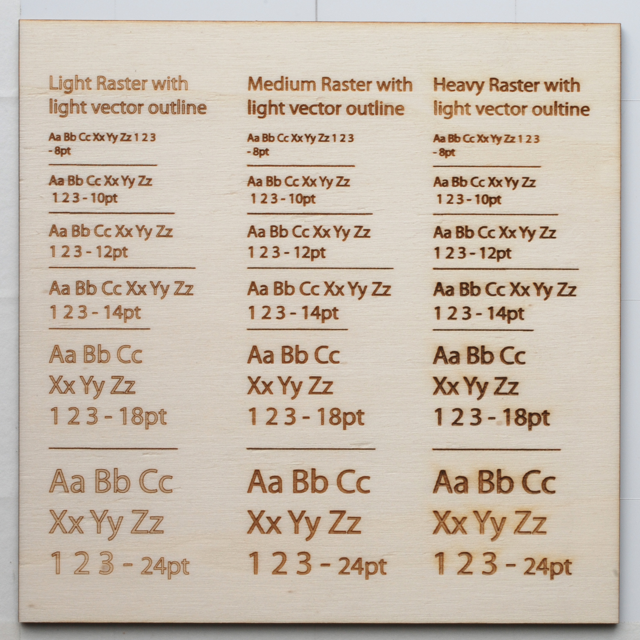
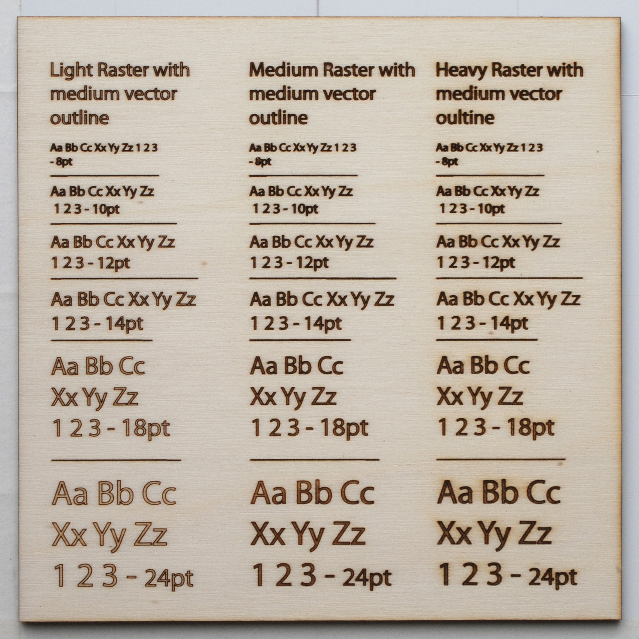
This test shows how the laser cutter handles raster engraving of different font sizes and how you can improve the quality of your engraving.
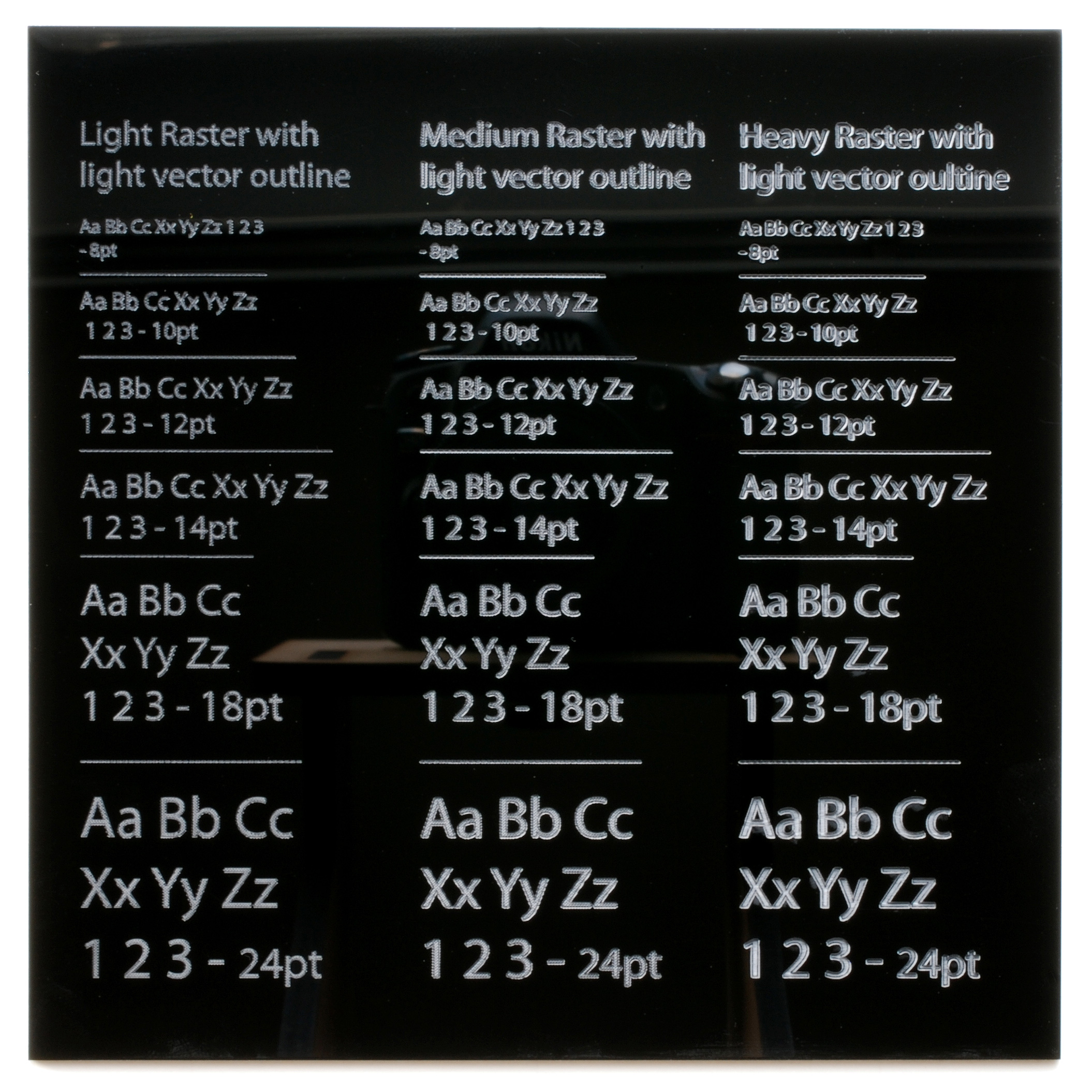
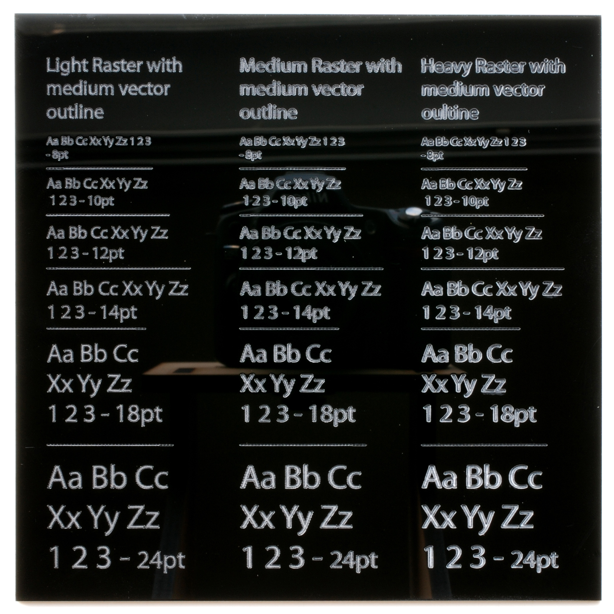
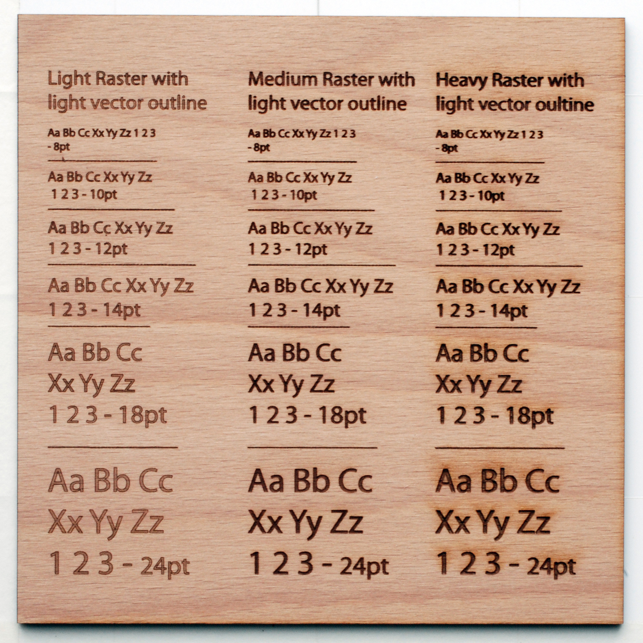
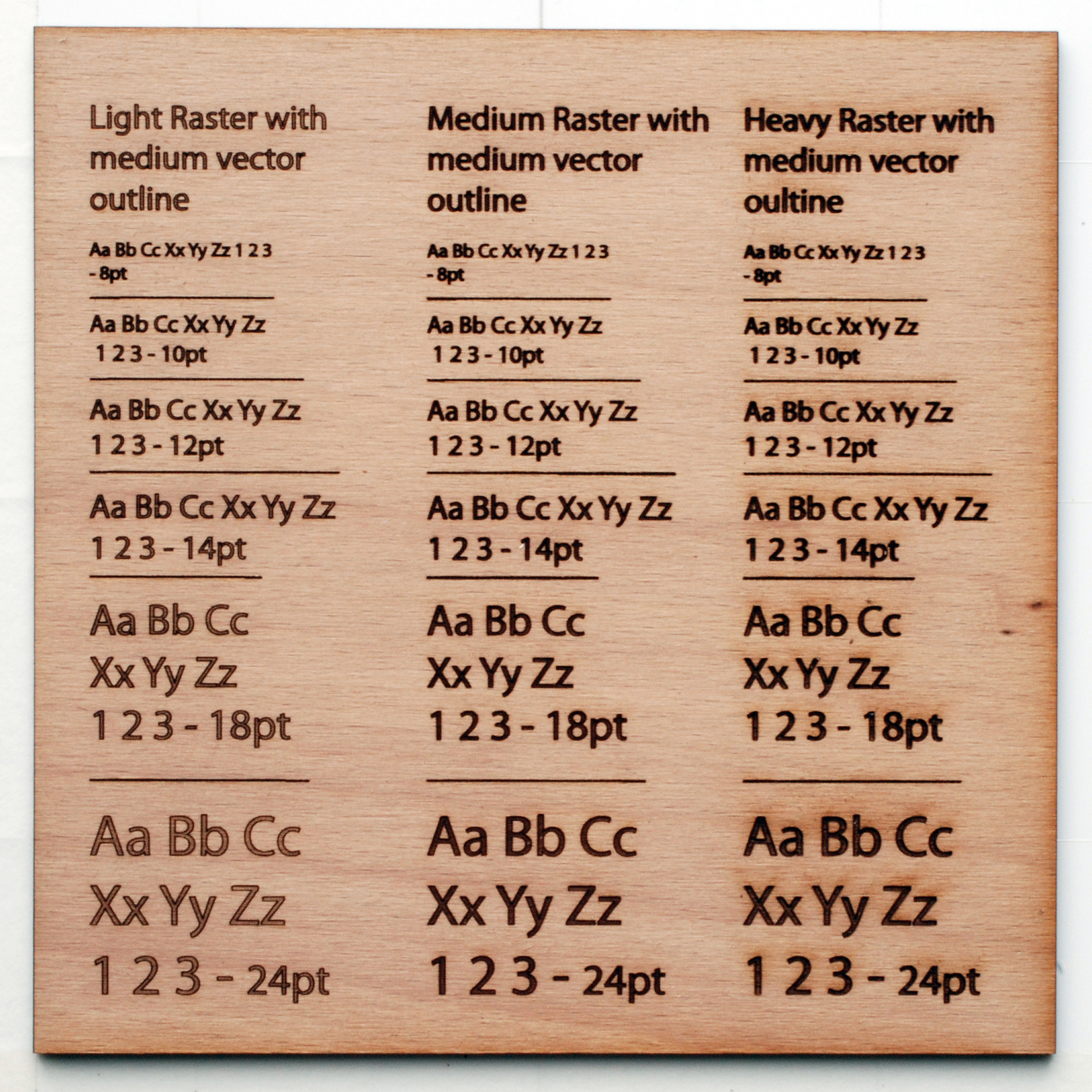
Our current set up uses 3 colors for 3 different intensities of raster engraving:
– light gray for light raster engraving
– medium gray for medium raster engraving
– black for heavy raster engraving
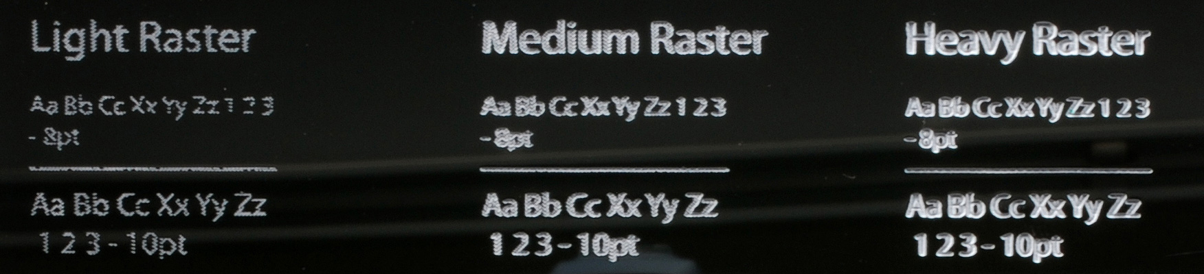
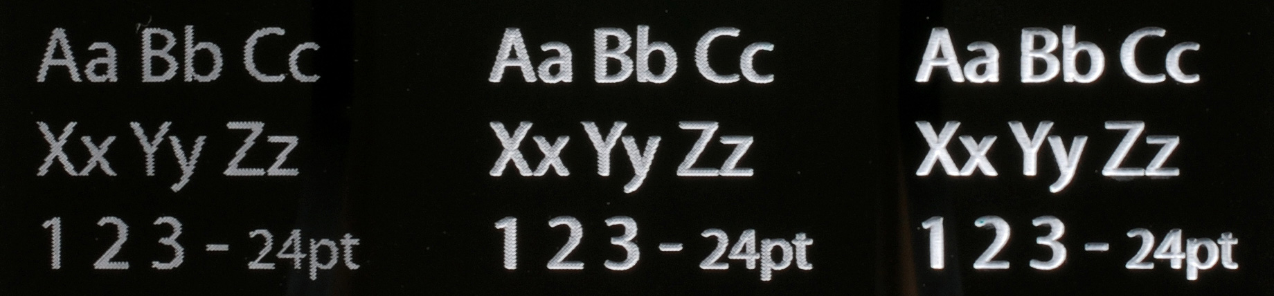
The way the laser cutter works is like an old dot matrix printer except instead of dots of ink it uses pulses of the laser beam. For the black the density of the pulses is the highest and you get good resolution. For the lighter engraving there is less density of pulses and this produces a lower resolution especially if the text or shape being engraved is small. This is most noticeable around the edges of the shapes and on curves or diagonal lines.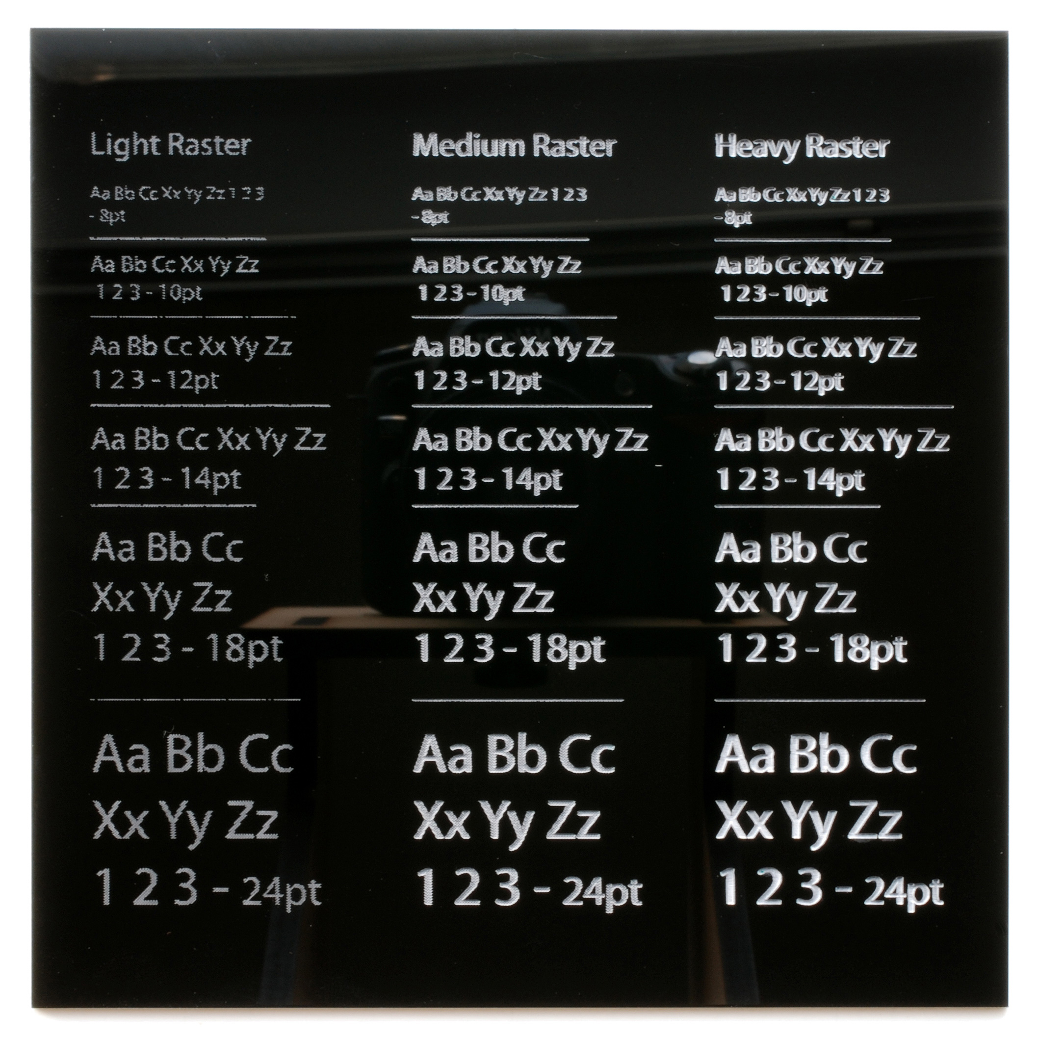
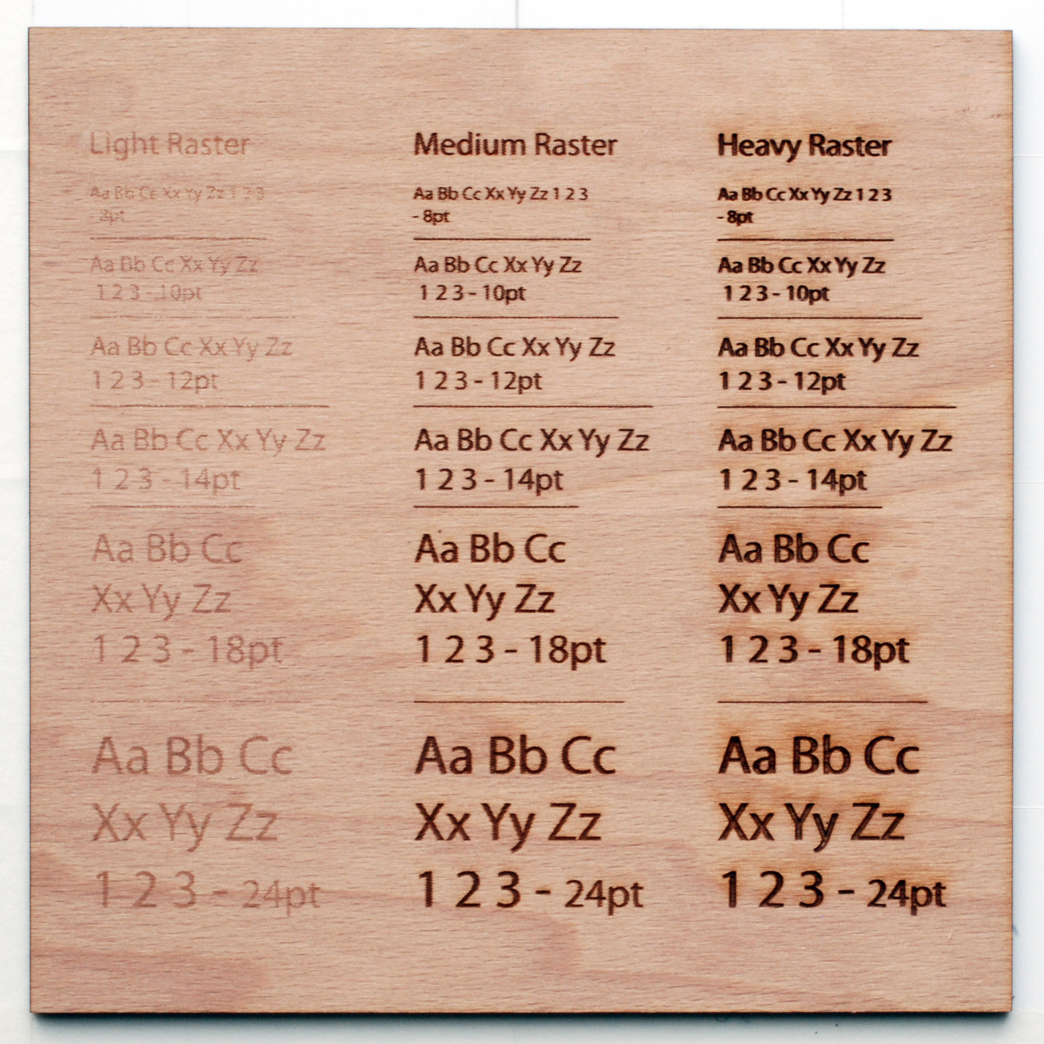
You can see what I am talking about below. With the smallest text pieces the resolution isn’t so great and some of the text is even missing whereas the heavy raster engraving has smooth lines and looks crisp.
One thing you can do to improve the quality of the engraving is put a vector engraving line around your text or shapes to make the edges more crisp. There are pros and cons for using this technique and it largely depends on which material you are using. Personally I like a heavy raster engraving on any of the plastics but a medium raster engraving with a medium vector outline on the timbers.
See below for more some detail shots of the different variations and make up your own mind from there.
In black acrylic –
In the technoply beech –
In eurolite poplar –

So this is a small selection of the materials but should give a fair indication of what to expect when raster engraving. Engraving on the timbers will produce a fairly similar result as the 2 shown and engraving on the other acrylic colors will have the same affect as on the black.
PETG or styrene are nearly impossible to photograph to show the differences in the engraving details and deserve a more specific post in the future. For now you can refer to this post in the forum which has a few tips in it.
5 Comments
This is great—it lets us see in detail what different fills look like without a lot of expensive prototyping. Would it be possible to get similar closeup images of text done as just a vector outline without a raster fill? (The pictures in the materials section are too small to really make out.)
Hey dan that’s a great reference, dead useful
john c
An etched scale on the examples would have been beneficial.
(did I miss it?)
@ Andrea – Yep I can arrange that.
@ Nevin – the size of the text should be able to give you a scale. If you need to you could print some text at that size to get an idea of how big the engraving is.
This was a nice help, thanks for the information!
Thanks to Dan for linking me here, the staff at Ponoko is quite helpful
Comments are closed.