Whether you’re reading a book, writing an email or playing with an app, chances are you’ve viewed, typed or designed with a font from Monotype—even if you don’t know it. The company has been around since 1887 and is known for some of the most popular designs, such as Times New Roman, Arial, Helvetica, Optima, Gill Sans and Palatino typefaces to name a few.
But there’s more to Monotype than these font favorites. In fact, the company has more than 20,000 typefaces.
The 12 Immutable Laws Of Trade Show Giveaways
Ever wonder what the ultimate list of trade show & conference giveaways looks like?
Each time a new typeface is launched, collateral is created to accompany it. The industry standard is to create specimen books or specimen pages: Printed manuscripts on each typeface showing it in use.
But since type is such an obvious visual medium, it’s much easier to show it in use rather than explain how it should be used. “For example, we try to steer away from just showing a paper book and saying this would be great for a sports typeface, for example,” says Jenn Contois, Monotype graphic designer. “Instead, we’d say this typeface is great for sports, so let’s create a specimen on rubber or leather to see how it plays on that material. This gives people a feel of how it would look in actual product scenarios.”
The challenge, then, is to create collateral this is just as unique and individual as the typefaces it supports. No two typefaces should feel similar when launched.
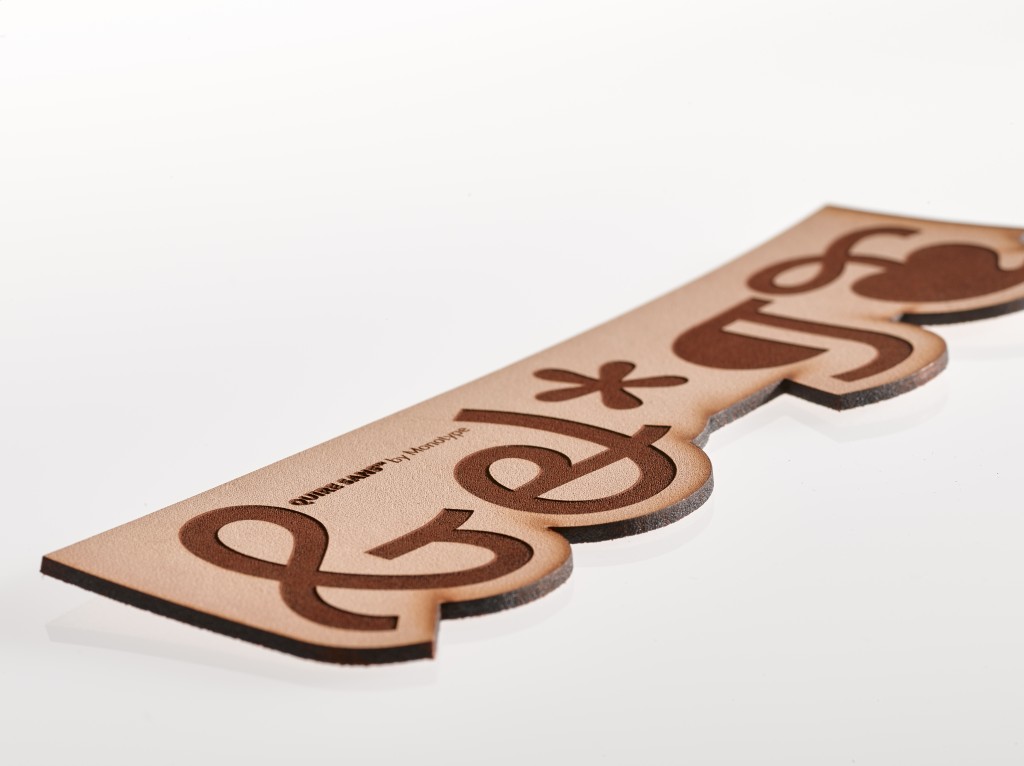
How Monotype Designed A Truly Custom Promotional Product
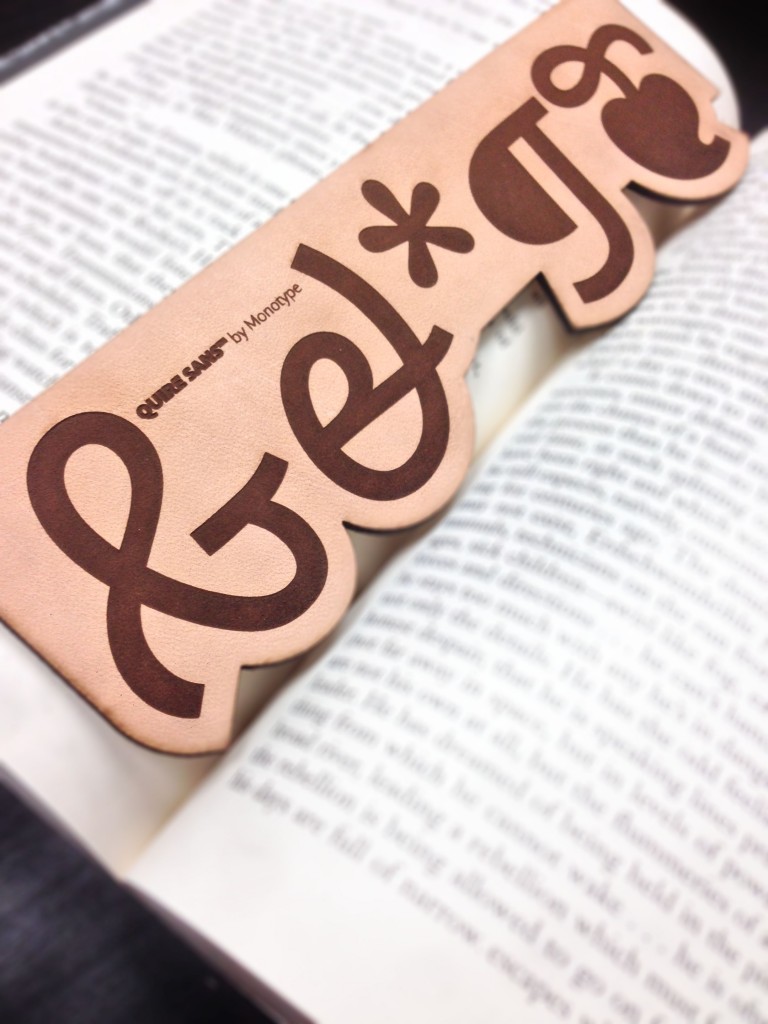
So when Monotype’s Quire Sans typeface debuted, Monotype needed some special swag to get the buzz going at an upcoming tradeshow. Since “quire” is a classical term for a signature of printed leaves, folded and ready for binding with other signatures into a book or manuscript, a bookmark was a natural fit.
But it couldn’t be just any ole bookmark. The product had to align with Quire’s sensibilities. It’s DNA. It’s a typeface for all media, and a mirror for whatever’s going on around it. Smiling but sometimes assertive. Slender but sturdy, when the need arises. And always eminently legible, large or small, on the page or on-screen.
While Monotype could have done a paper bookmark, those are too easily thrown away after an event. It needed to be something more tactile. More substantial.
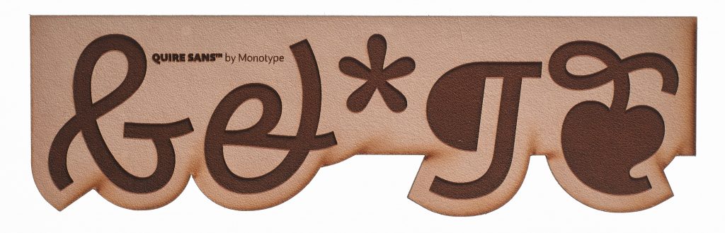
“We chose leather because it has a stronger connection to the history of book making—leather binding and leather bookmarks,” says Contois. “It’s also a nice material to receive. Recipients want to keep it and use it, and therefore your marketing efforts reach a bit further.”
How Tradeshow Event Attendees Responded
The strategy worked. The leather bookmarks cut through the event swag clutter and got noticed.
“You could hear attendees talking about it when they got their merch bag,” says Contois. “With most things, they’re flipping through. But, to have someone stop for three seconds to see who you are and what you’re doing is a big win when you have 50-60 items in a bag.”
Why Monotype’s Strategy Worked
So why did this event swag succeed where others fail? First, the bookmark was eye-catching and substantial enough to get noticed. Second, it was directly tied into Monotype’s brand DNA. It was truly custom, not simply a decorated catalog item. The bookmark showcased the new typeface in a way that was not only thematically aligned with the typeface, but also with the company’s overall brand story—and that’s where the swag magic happens.