Layers and Shadows

The play of light and shade on crisp laser cut linework has an eye-catching impact that is both dynamic and alluring. With only a little more effort than it would take to prepare files for printing in a more traditional 2d format, it is possible to use the same visual structure to create laser cut layered artwork that can literally jump out from the page.
Why does it work so well?
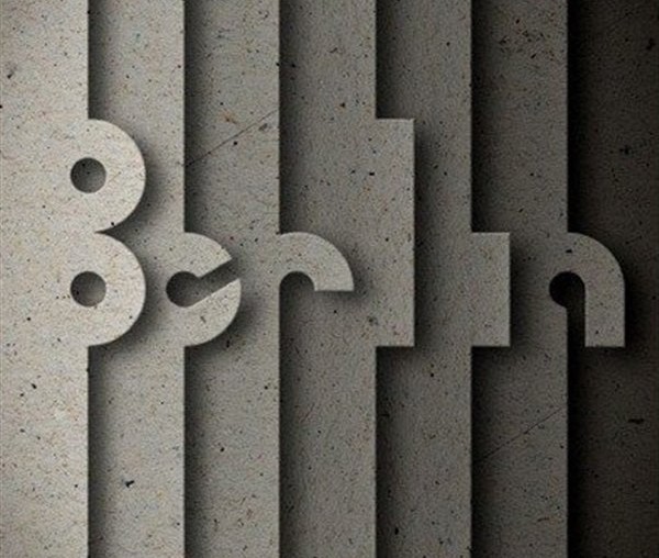
The example pictured above demonstrates that this approach to 3-dimensional graphic design can be applied with great effect to simple text and logos. When given only a partially complete outline of each letter, the eye naturally resolves the missing details. Further support from environmental lighting can also enhance the stratification in the design. This allows the geometric forms of the custom font to be instantly recognisable even without prior knowledge of what the typeface looks like.
How to use this technique with your brand
Some of the best laser cut designs are also the simplest. This is particularly true when working with layered material and sections that are cut or removed; the less complicated your design can be, the fewer the potential errors when it all comes together. Remember to work with the strengths of laser cutting, making use of (to name a few): crisp linework, precision alignment and the elegance of accurate repetition.
Can you think of a clever way to harness light and shade using laser cutting with the Ponoko Personal Factory? Let us know in the comments below. For more ideas for Agencies and Brands, see the other posts in the series.
image source: viral3k.com